Growing a Product Through Continuous Design
Helped transform Stasher's digital experience over four years by redesigning its ecommerce ecosystem, improving conversion, and building scalable systems that grew with the business.
Senior Digital Designer → Digital Art Director • E-commerce • 2019–2023
When I joined Stasher, the product had already built a loyal following, but the digital experience hadn't kept pace with the brand itself. Over the next four years, I helped redesign nearly every part of the customer journey, from the website and product pages to email, social, and campaign launches.
What started as a series of redesigns gradually became something much bigger. As the business grew, I found myself thinking less about individual pages and more about how every touchpoint could work together as a cohesive system that would continue evolving alongside the company.
Build for What’s Next
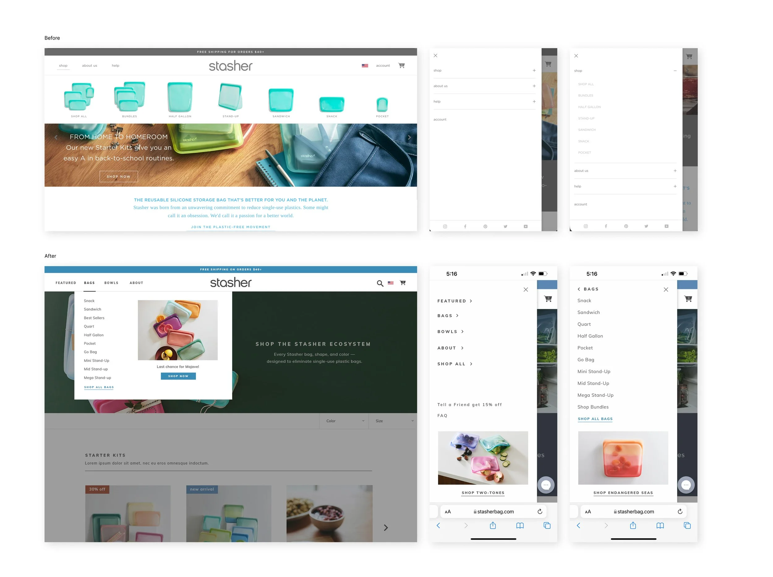
The moment we started planning for the Beauty bag launch, it became obvious the navigation was not built for where the business was headed. It had worked well when the product catalog was smaller, but adding an entirely new category exposed the limits of the site's structure.
Rather than simply finding room for another menu item, I saw it as an opportunity to rethink the navigation from the ground up. I looked at a broad range of e-commerce navigation patterns, explored multiple directions, and worked closely with engineering to understand the development effort behind each approach before refining the final solution.
Once we landed on a direction, we planned for what would happen after launch. We introduced analytics, watched how customers actually used the navigation, and continued refining it based on real behavior. One small addition, a featured product area inside the navigation, became one of the most engaged-with elements and gave the marketing team a flexible way to highlight launches without redesigning the experience each season.
Looking Back
Looking back, I do not think the navigation redesign was really about navigation. It was the first time I experienced how quickly a growing business can outgrow the systems that once worked perfectly well. Since then, I have found myself asking a different question at the beginning of projects: Will this still make sense a few years from now?
Repetition is an Opportunity
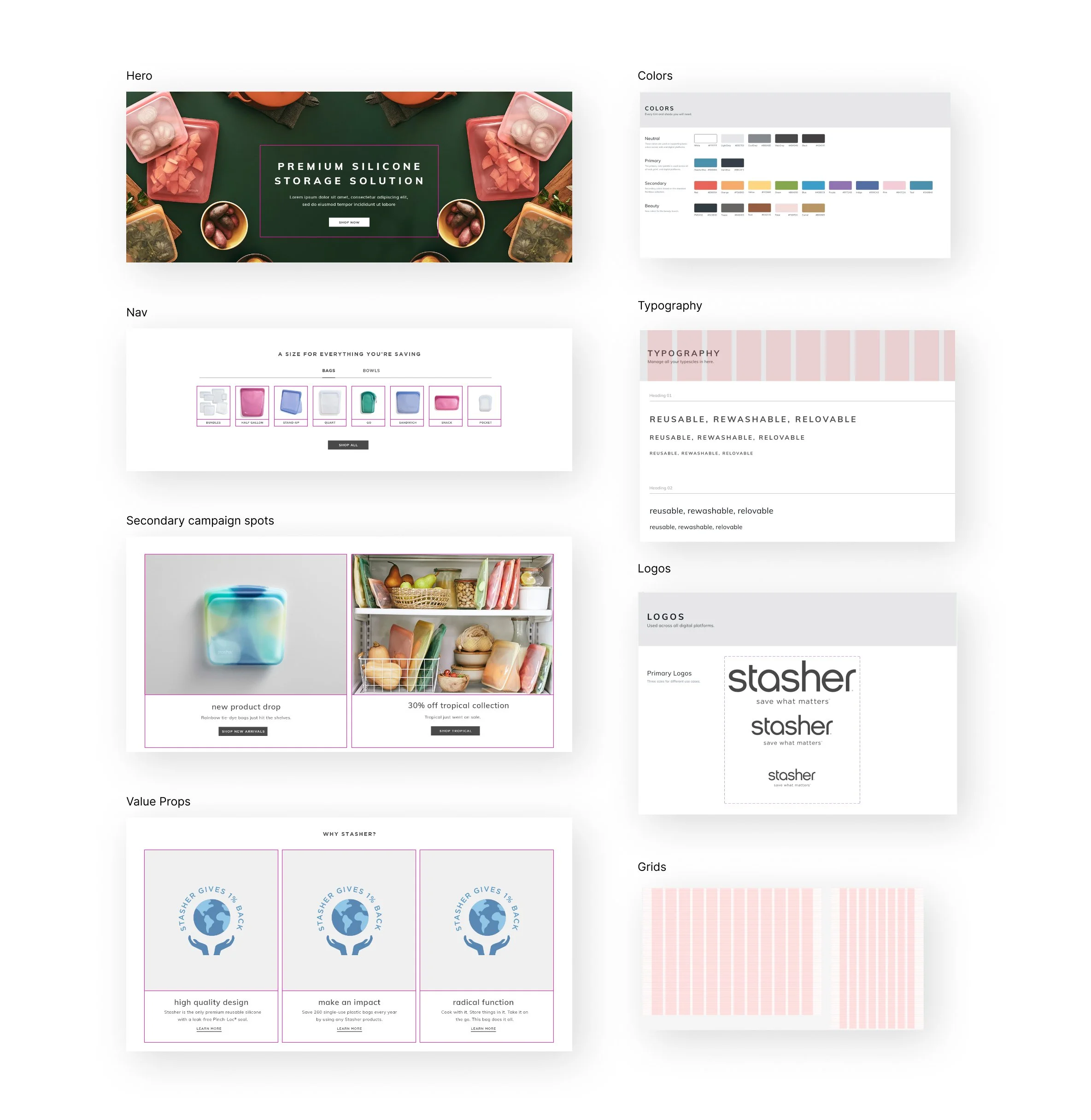
At one point I realized we were rebuilding the same layouts over and over again. Every campaign started from scratch, every landing page required another custom solution, and every update asked engineering to solve problems we'd already solved before.
Instead of continuing that cycle, I partnered with engineering to build a library of reusable website sections that could be mixed and matched across the site. Marketing gained the flexibility to launch new campaigns quickly, development became more efficient, and the website became much easier to evolve over time.
Around the same time, I led our migration from Adobe Creative Suite to Figma. Getting buy-in wasn't really about introducing a new tool—it was about showing the team how reusable components, templates, and shared standards could remove repetitive work and make collaboration much smoother.
Looking Back
I don't remember the day we finished the design system. I remember the moment people stopped asking for the same files over and over again. The system quietly became part of how the team worked, and that's when I realized the best design systems almost disappear into the background.
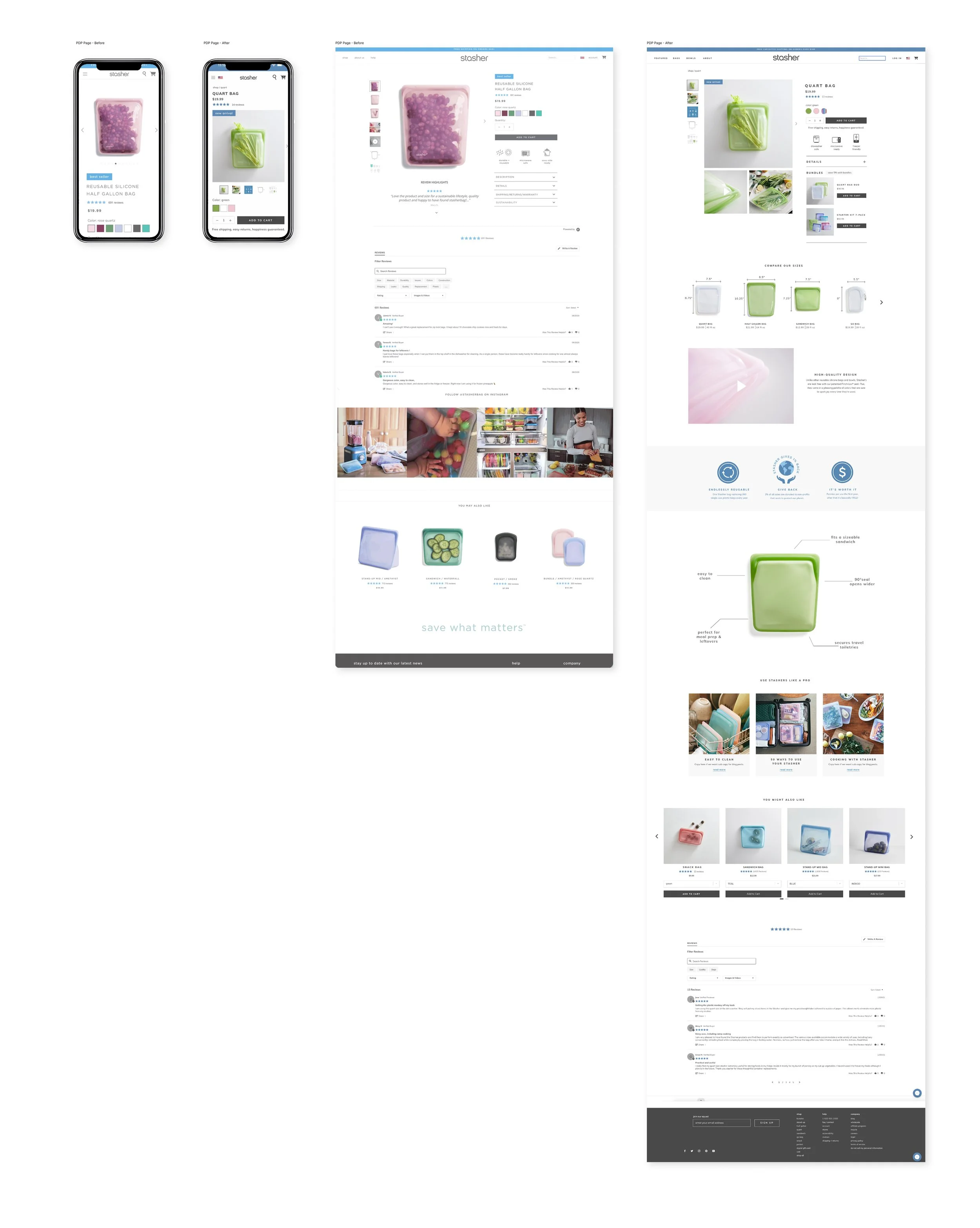
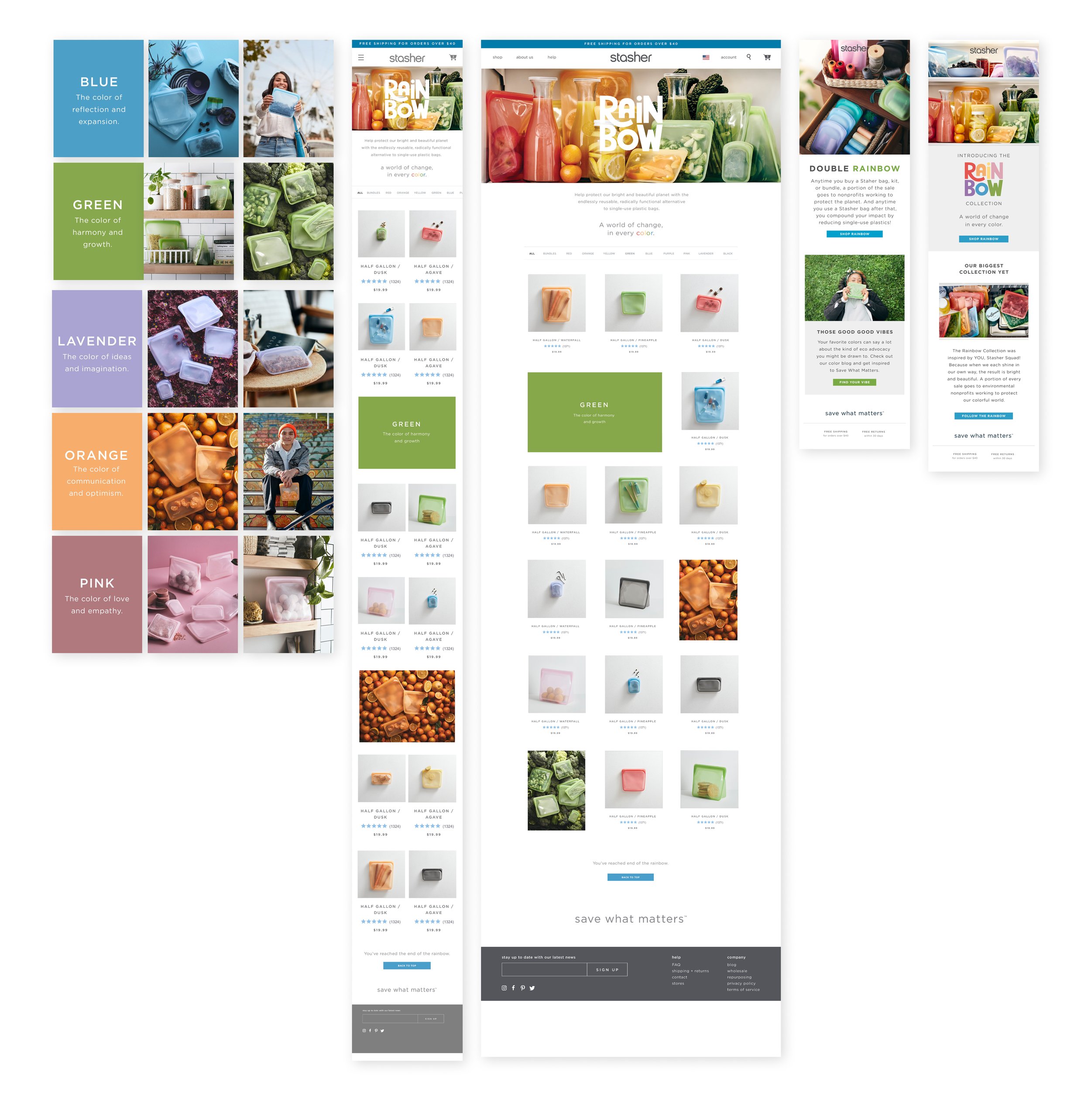
Sweat the Right Details
Nearly 70% of customers were shopping on mobile, so every conversation about the product detail page started with a simple question: What absolutely needs to be visible before someone scrolls?
We simplified the overall layout while introducing reviews, comparison charts, product videos, stronger photography, and clearer value propositions. After several rounds of iteration, we narrowed the redesign to two directions before using A/B testing to validate where elements like reviews, sustainability messaging, and product benefits belonged.
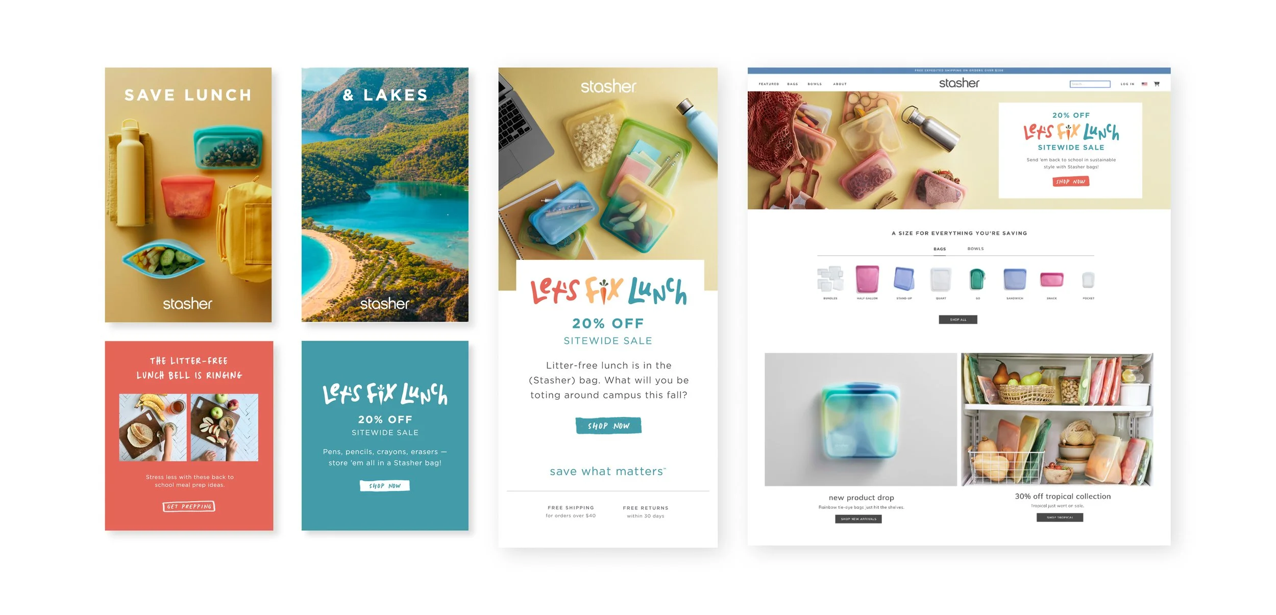
The same thinking extended beyond the website. I planned and led lifestyle content shoots, collaborated on larger brand campaigns, and worked closely with marketing so the website, email, and social channels all felt like parts of the same conversation rather than separate deliverables.
Looking Back
One tension I still think about from Stasher is balancing the level of craft you want with the resources you actually have. We never had unlimited time or budget, but I also never wanted that to become an excuse for lowering the quality bar. It forced me to become much more intentional about where craft had the biggest impact, and I still approach projects that way today.
Collaboration
As the digital team grew, so did my role. I hired and mentored junior designers, delegated work across web, email, and social, and partnered closely with marketing, engineering, and creative leadership to keep projects moving while raising the overall quality of the work.
Running content shoots became another extension of the design process. I was not just designing the interface anymore. I was helping shape the imagery, storytelling, and assets that would eventually live inside it. Seeing those pieces come together made the digital experience feel much more cohesive.
Outcome
Over four years, the digital experience evolved from a collection of individual initiatives into a scalable ecosystem that could support new products, campaigns, and continued business growth.
The redesigns improved conversion across key ecommerce experiences while creating systems that helped the team move faster, collaborate more effectively, and continue evolving the product without starting from scratch each time.