Helping Customers Choose With Confidence
Reimagined Stasher's product comparison experience to help customers make better purchasing decisions, increasing conversion, reducing returns, and creating a more confident online shopping experience.
Digital Art Director • E-commerce • 2019-2022
One question kept coming up through our customer care team.
"Will this fit?"
Customers weren't returning products because they didn't like them. More often, they simply hadn't pictured the size correctly. We'd hear things like "It didn't fit my sandwich" or "It wasn't what I expected."
That made us realize we weren't missing more product information. We were missing the feeling of holding the product in your hands before buying it.
Everything we designed after that came back to one question. How can we make shopping online feel just a little more like shopping in person?
Helping People Picture the Product
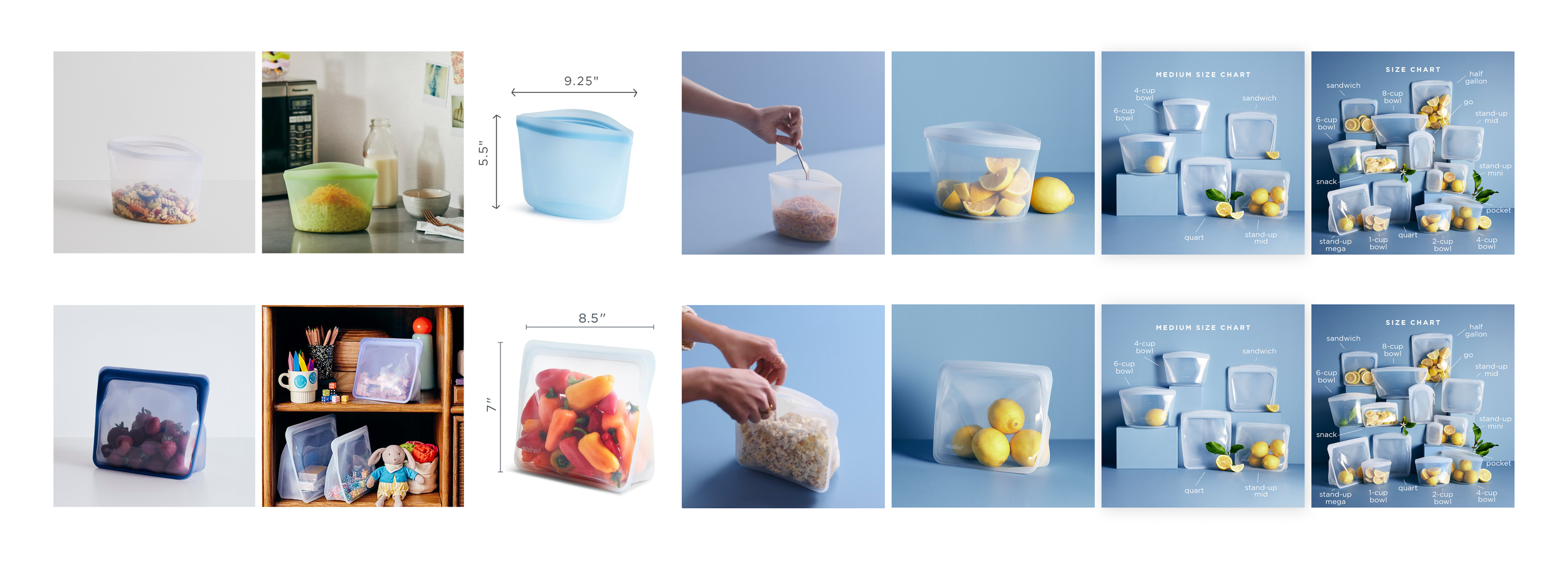
The first instinct was to build a comparison chart, but it quickly became obvious that no single feature was going to solve the problem. Some people wanted measurements. Others wanted to see the bags next to each other. Others needed to watch someone actually use them.
Instead of asking customers to interpret a table of dimensions, I started thinking about all the different ways we could help someone understand scale naturally.
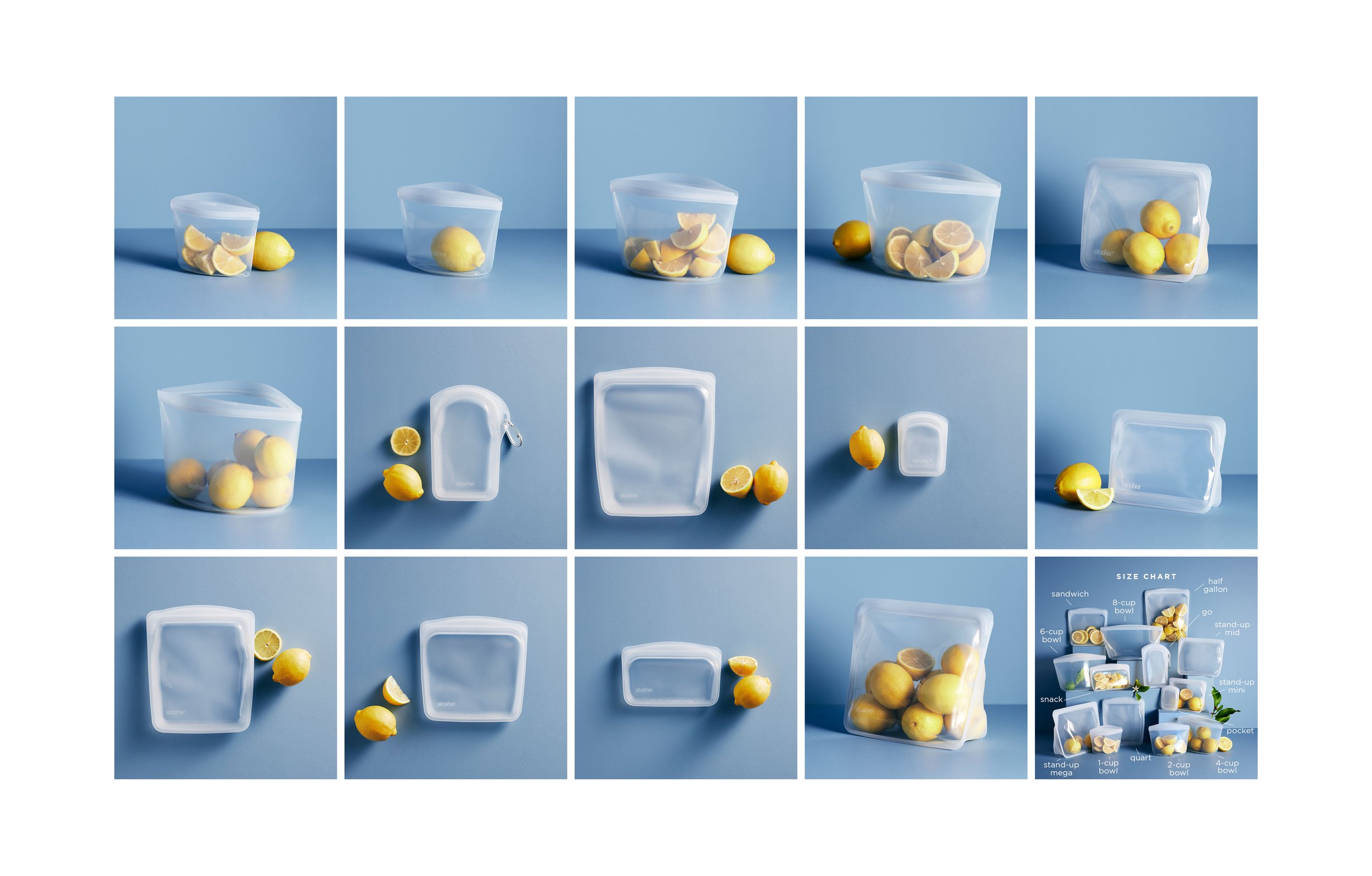
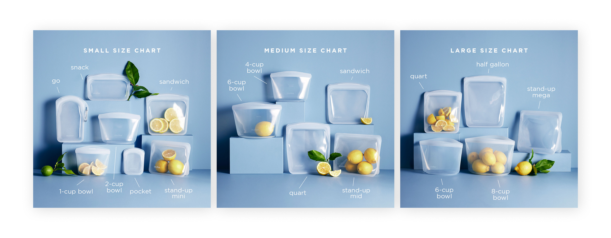
We added measurement photography directly into the PDP carousel, created bundle images showing every size together, introduced a size chart similar to what you'd expect when buying clothing, and produced short videos showing real objects being placed inside each bag. Within this system, we used a lemon as the common denominator. Showing it in each product size further helped customers accurately compare.
None of those pieces solved the problem on their own. Together, they made it much easier for customers to picture the product in their everyday lives.
Looking Back
I still think about this project whenever someone talks about product comparison. We weren't really comparing products. We were helping people build confidence. Once I started looking at it that way, the design decisions became much simpler.
The Right Information at the Right Time
Once we knew what information customers needed, the next question became where it belonged.
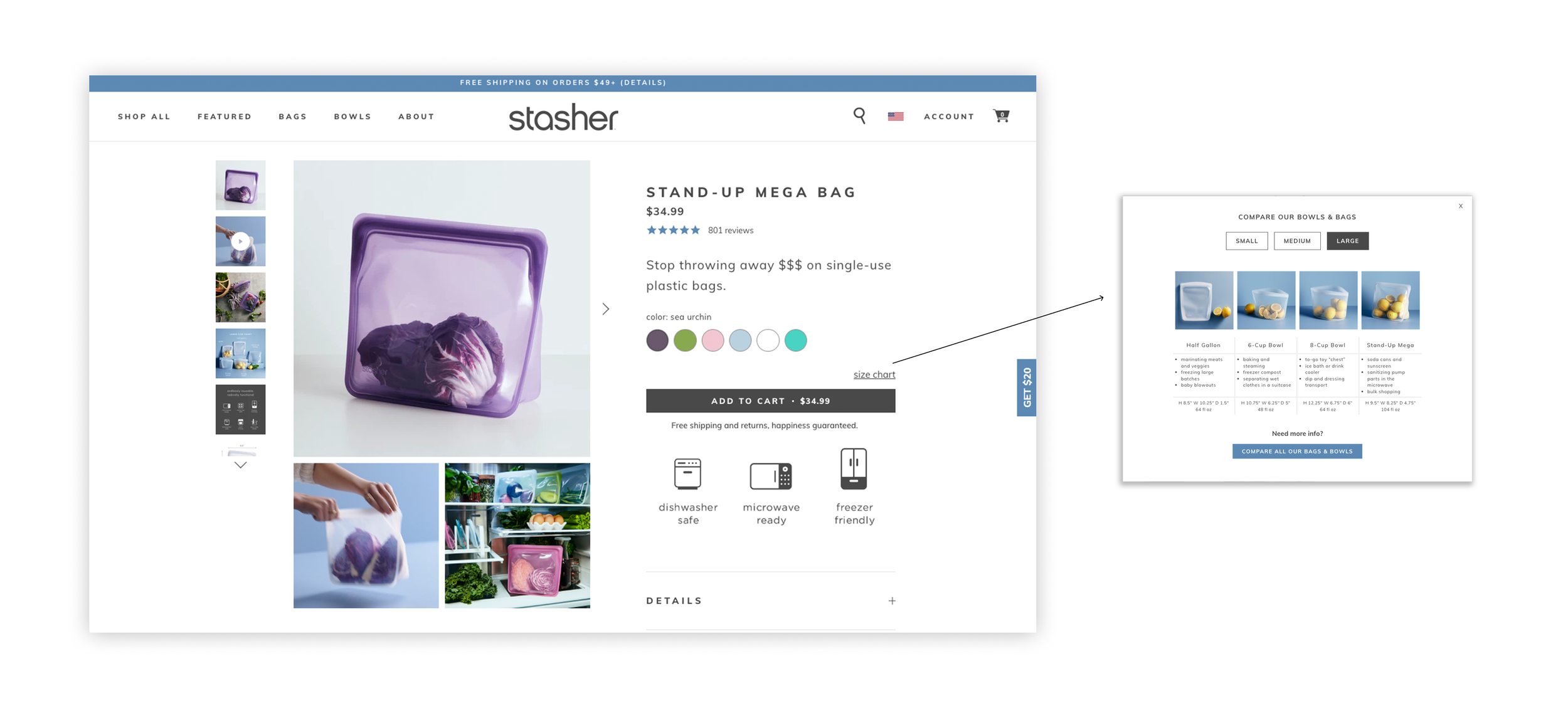
Through research and testing, we realized comparison tools became much more valuable once someone had already landed on a product page. At that point they weren't deciding whether they liked Stasher. They were deciding whether this was the right size for what they wanted to store.
I researched comparison patterns across e-commerce, gathered every relevant detail about each bag including dimensions, tare weight, and common use cases, and explored several different directions before working with leadership and engineering to refine the final experience.
Even after launch, we continued testing where comparison content appeared on the page. Small changes in placement made a noticeable difference in how people interacted with it.
Looking Back
One thing this project reinforced for me is that good product design isn't only about deciding what information belongs on a page. It's also about understanding when someone is ready for that information. Timing can be just as important as the content itself.
Building Confidence Across Every Touchpoint
As the project evolved, it became clear that the experience couldn't stop at the interface.
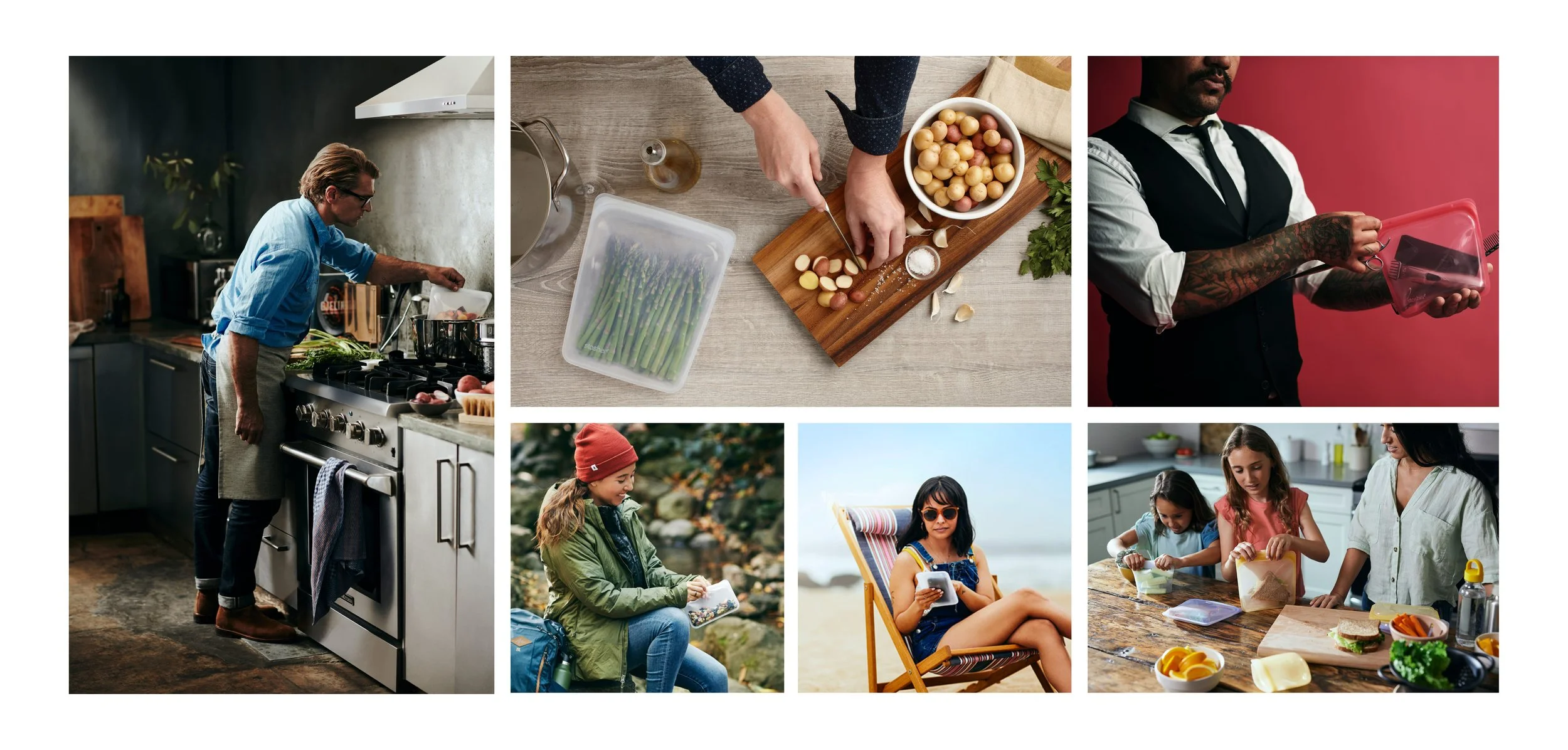
I planned new photography, organized comparison bundle shots, directed PDP videos, and worked closely with engineering to bring each piece together. Every asset answered the same question from a slightly different perspective until customers no longer had to imagine how the product might fit into their lives.
Looking back, that's probably my favorite part of the project. It wasn't one feature that made the experience work. It was the combination of imagery, motion, content, and interaction all reinforcing the same story.
Looking Back
This project changed how I think about e-commerce. The goal isn't to show people more information. It's to help them imagine themselves using the product. Once that happens, making a decision becomes much easier.
Collaboration
I led the project from research through implementation, partnering closely with marketing, engineering, and leadership throughout the process.
Along the way I researched comparison experiences across industries, explored multiple design directions, planned and produced new photography and video, collaborated with engineering on implementation, and continued refining the experience through testing after launch.
Because every piece depended on the others, the project became less about designing individual screens and more about creating a complete decision-making experience.
Outcome
Customers who engaged with the new size chart showed:
20% higher conversion
8% higher average order value
$31K increase in revenue driven by higher AOV
The experience also reduced product returns and customer support questions by helping customers choose the right product before they reached checkout.